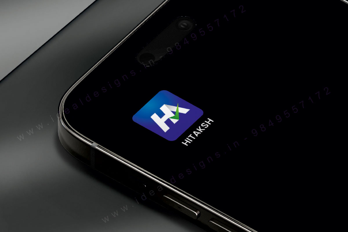
We are living in a world of apps. From entertainment and infotainment to finance and professional life, we depend on several applications thoroughly. And needless to mention, we all have apps that we choose over the others! One of the leading reasons why we choose one over the other is the apps’s identity – and when it comes to identity, the logo design is the first thing that users look at.
The app logo is crucial because it represents the brand’s purpose, personality, and functionality – and all of them make up the brand identity. Given the importance of an app logo in order to become a popular choice, we are giving out the secret to creating the best app logo design for your brand: –
If you want to establish your brand as having a unique identity of its own, you need to first start with a distinct logo design that immediately sets it apart from the other competitors. The symbol is the main focus of an app icon. For example, look at the popular apps like Instagram, Facebook, Whatsapp, Linkedin – their app icon is how they are identified. A monogram logo, which is a combination of specific letters to create a distinct symbol, is a popular choice to go for.
The visual design of an app logo is what grabs the attention of the customer. Using gradients and appropriate blur techniques can boost the overall impact of your app logo design by making it more dynamic and trendier. Consider the colour combination in the app logos of Messenger and Instagram – it is one of the key reasons why people end up clicking on them more.
A quick sneak-peek into the meanings of different colours :
• Orange represents fun, friendliness and a lively ambience
• Red stands for passion, dominance, and love
• Green symbolizes optimism, growth and sustainability
• Blue stands for trust, confidence and loyalty
It is not easy to deal in simplicity. Simplicity is not just about using a simple logo – it’s about thoughtfully coming up with the perfect example of elegance. A minimal, clean app logo speaks volumes about its professionalism and reliability. As a test, we ask you to look at all the major companies of the world: they will all have logos that are crisp, neat and minimal. Less is more.
With the colour BLUE: Headway, Discord, Twitter, Wordweb, Amazon Prime Video, ZOOM, Journey, Mobikwik
With the colour PINK: Airbnb, Darkroom, Instagram, Flo
With the colour GREEN: Duolingo, Alltrails, Google Hangouts, Whatsapp, Dunzo, Spotify
Minimal app logos : Snapchat, Chatly, Reddit, Spree, Telegram, Youtube, Flipkart, Amazon, Nykaa, Bigbasket
IDEAL Designs has created a name for itself by creating the best minimal logo designs for several key businesses across India. We are the best app logo designers based in Hyderabad offering innovative and attractive logo designs that instantly elevate you in the competitive ocean of apps by establishing your brand reputation and creating a unique identity. We craft minimal designs using several colour combination gradients depending on the requirements of our client and the suitability of the application. Choose your ideal logo design with IDEAL Designs today!
Meet the most trusted app logo designer company in Hyderabad, call now (+91 – 9849557172, 9949645564)
LOOKING TO COLLABORATE WITH A CORPORATE BRANDING AGENCY IN HYDERABAD OR BANGALORE ? GET IN TOUCH WITH US NOW!
For More >>
